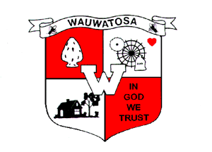
Wauwatosa's official emblem was drawn in 1957 by Suzelle Vallier, a nine-year-old girl "with a page boy bob and sparkling eyes" who won a city-wide contest for kids, according to a story in the Milwaukee Journal.
"My legs felt weak after Mr. Meier made the announcement," she told the Journal, referring to the president of the Common Council at the time.
More then half a century later, Wauwatosa officials are questioning whether the logo still represents the city. At a Council of the Whole meeting Tuesday, an ad hoc marketing and communications committee suggested the city consider changing its logo and developing a brand.
"What I see when I look at that (logo) is a community that's kind of stuck in its past," said Alderman Dennis McBride, president of the council. "I don't see the dynamic Wauwatosa of today. I don't see a lot energy there; I see stasis."
The logo, which is divided into four pieces, represents the foundational aspects of the city, according to the Journal's story. In the upper left, an arrowhead stands for the Native Americans who used to live on the land. Hart's Mills of the 1800s, which included saw and grist mills on the Menomonee River, are depicted in the upper right corner.
The lower left symbolizes Wauwatosa as a "city of homes," while the lower right represents a "city of churches." The lower right quadrant was originally a cross, but has since been changed to the words, "In God we trust."
Beth Fredrickson, a communications professional and volunteer on the ad hoc committee, said the logo misses many of the aspects that are currently attracting residents and businesses to the area.
"We think there's a new story about Wauwatosa that's waiting to be told," she said.
Many alders agreed. Alderwoman Allison Byrne called the logo "dated." Alderman Jeffrey Roznowski called it "not competitive." But others expressed concern about straying from tradition.
"This is timeless, to have the origins of the city," Alderman Jason Wilke said. "I think to waste our time on that when we have so many things to do, it would be my guidance that the shield isn't the issue compared to the marketing materials and having a consistent image."
Part of rebranding
Mayor Kathy Ehley said considering the logo change is just one piece of a branding process needed for Wauwatosa.
The presentation Tuesday was the first of several coming from the ad hoc committee, which will eventually recommend the city contract out marketing work. Ehley said it was too early to say how much such a contract would cost, but it would begin with focus groups in the community to identify the city's brand and end with new marketing materials.
"We need to develop a strong brand and consistent image," Ehley said. "We're in competition with the communities around us and we want to make sure we create the desire for residents and employees to come here."
The process could include crafting materials for people and companies looking at the city as a destination, and coming to consensus on the city's identity and goals so that officials have a consistent, recognizable voice.
More information will come in future presentations to the Common Council.
Twitter users weigh in
More from News and Features
- Anodyne Coffee plans to open location in Wauwatosa Village
- Wauwatosa Meetings: Aug. 4
- Video: Wauwatosa girl's curbside ice cream stand raises money for the hungry
- Wauwatosa News and Notes: Hands-only CPR training offered; Firefly Art Fair is Aug. 6-7
- Wauwatosa Ask Now: Why are there barriers and fencing along the North Avenue bridges over the Menomonee River?
- Mystery Photo Contest: July 28
- Wauwatosa gears up for National Night Out event, this year at the zoo
- Election 2016: Wisconsin's 4th District candidates weigh in
- Wauwatosa's Luther Manor residents share smiles through flower delivery
- Wauwatosa Police Report: July 17-23


